Conversation Entries
Guidelines
The bulk of the conversation is comprised of conversation entries. This is "what is said/sent". In addition to entry types, this section touches on ethical concerns & content visibility
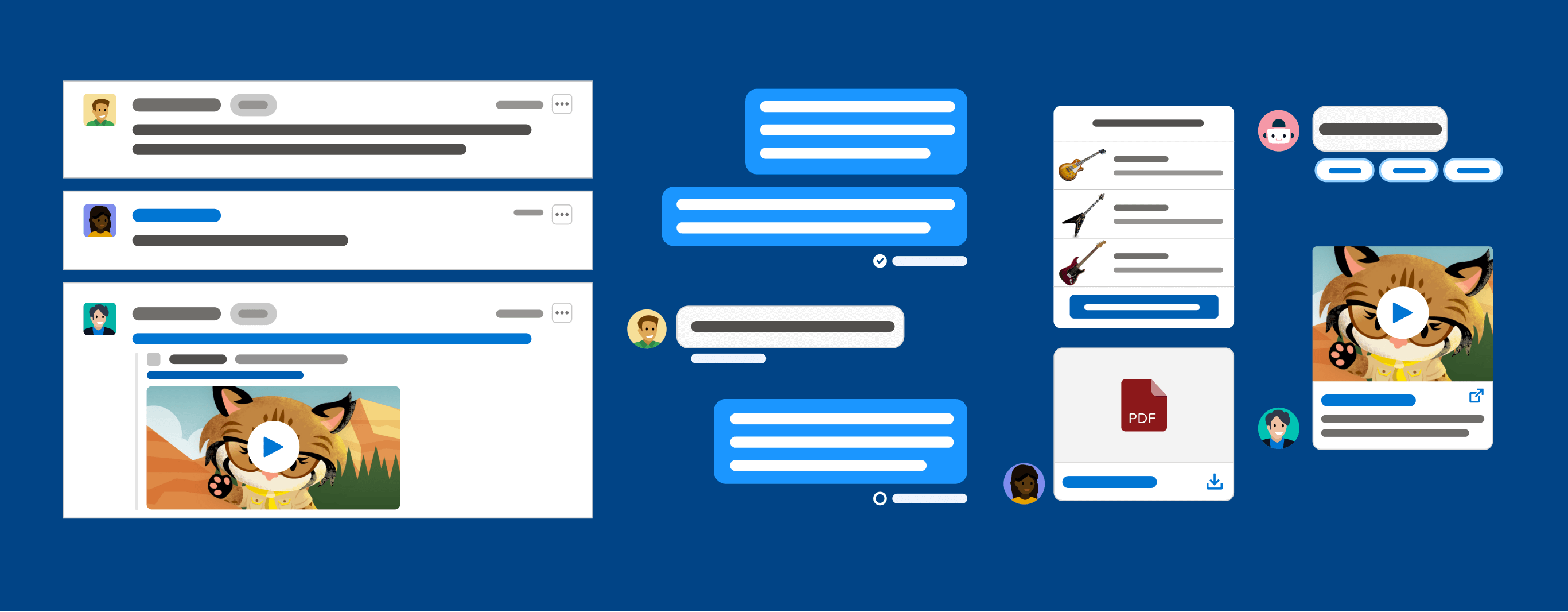
Introduction
Conversation entries go by many names: messages, conversations, transcripts, dialogs, and dialog groups to list a few. Each team or group may have different ways to refer to conversation entries, and for now, we don't have a POV on which term is best. We'll be using "conversation" within this guideline for consistency, but keep in mind that some teams use different terminology.
Individual conversation entries are usually represented as bubbles or line items that contain the content of the conversation. These entries are often grouped together, encompassing an entire conversation, though they can be used individually as highlights or "snippets" to summarize important takeaways. Some conversation applications have a feature to favorite, save, or pin particular conversation entries.
Design Resources
Download Sketch KitConversation Terms & Definitions
Content
What was said or sent, such as text, file attachments, or structured content.
Participant
A user who says or sends content in a conversation.
To start, you'll need to know who the participants are. Since we will be focusing on the B2C conversation experience, you'll want to consider if this conversation UI is meant to support conversations between employee & customer, employee & employee, or customer & customer.
Another important consideration is whether bots will be participants in the conversation. The first thing a bot should do is warmly introduce themselves to the user and clearly identify that they are a bot. This establishes trust with the user and sets the right expectations in the beginning. Giving your bot a name is a great way to personalize the bot. Try one that isn't too common of a human name to avoid triggering the uncanny valley. It's also a good idea to use a product logo or robot graphic for the bot avatar to keep things transparent.
Avatar
Helps break up conversation and quickly identify which participant said or sent something. If using avatars, it is important to define a default/fallback. The users' initials are ideal, as they help identify the user and differentiate from others. Another common fallback is providing a default avatar photo if users are not uploading images for their avatar. Some conversation applications that use avatars will display them for all users. Others will intentionally only show the user the avatar(s) of other participants besides themself.
For bot participants, the avatars need to indicate that the end-user is conversing with a bot.
Avatars can be represented using circles or rounded rectangles. For example, Slack uses rounded rectangle-shaped avatars while Quip and Salesforce use circle-shaped avatars.
Note: We design experiences for a range of visual abilities, and avatars won't be helpful for all users.
Label
This can be used to identify "who is who" in conversations as small as two and as large as a conference. For instance, the labels "Agent", "Dedicated Rep", "VIP customer", or "Tier 1" can be used to also quickly call out any pertinent information.
Typing Indicator
An indicator for text-based channels or real-time transcription of audio that shows when a user is actively typing. There are some ethical privacy concerns to be aware of when dealing with typing indicators.


Actions Available to Conversation Entries
The actions that can be taken during a given conversation entry. Different circumstances may require different sets of available actions, so consider the following: Should actions differ from real-time to historical? Should users be able to edit, delete, share, pin, or bookmark messages? Do users need a "Save to Library" functionality to catalog good (or bad) examples from customer conversations?
It's also important to consider how available actions might change based on the type of content, text might allow editing and forwarding actions, while images may allow drawing or saving actions.
Consider how some of these actions fit into the Service or Sales use cases. We don't want agents or users to be able to modify or manipulate sent messages.
Action Indicators
An indication that shows if a message has been delivered, received, read, edited, or deleted. This can include system messages, such as when a user joins a conversation in addition to read receipts or even error messages related to sending or receiving messages.
Timestamp
An indicator that shows the time when something was said or sent.
Conversation Entry Anatomy


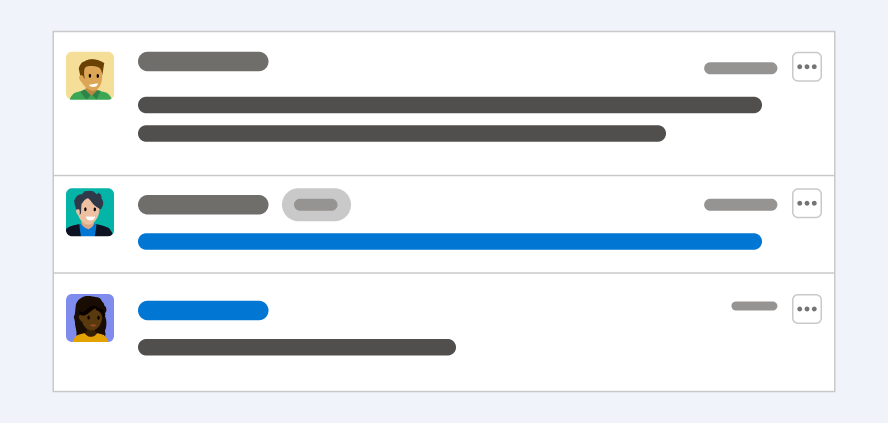
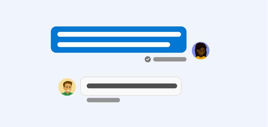
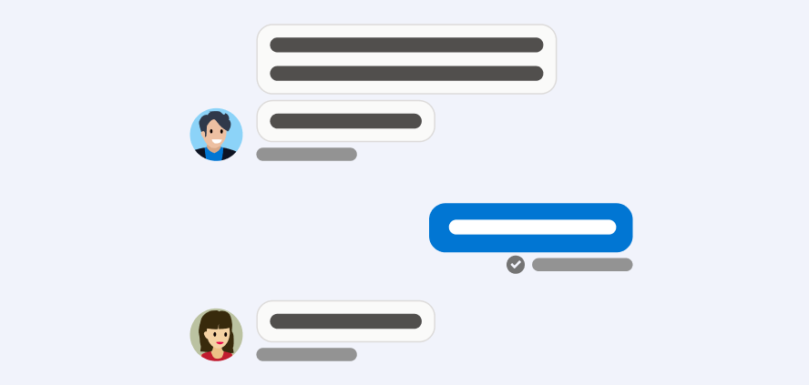
Above are three images of simplified conversation entries. The first represents a threaded UI style and the other two represent chat bubbles. These styles will be discussed in more detail in a later section of this guideline.
Error Handling
Conversation experiences should have a way to handle when a variety of errors occur. How and where the error is relayed to the user is important to consider. Often errors on a particular conversation entry will be expressed via text and an icon below the entry itself (where action indicators like read receipts are). With accessibility in mind, there should be a game plan on how a screen reader will be notified of errors.
Examples of errors to consider for conversation entries include the following:
- Validation errors like too many characters, or incomplete email addresses
- Offline message waiting to finish sending
- Network connectivity issues
- Fetching detail errors
Ethical Concerns
With read receipts and typing indicators, there might be ethical concerns around privacy. All parties should be able to configure if they want to turn this functionality off.
Enabling users to take edit or delete actions on a message that has already been sent (and seen) can bring up ethical concerns around the integrity of this data.
For instance: allowing a participant to edit what they said for internal communication (such as Slack) is generally fine, as they might have made a typo or said something unclearly. However editing an entry between an employee and a customer is changing the source of truth, potentially covering up something that should not have been said, or skewing the analysis later on.
The same goes for simply deleting something that was said in a conversation between, say, an agent and a customer. Showing metadata of how many times something has been edited/deleted and recording every edit might be a way to allow for the integrity of data. If a revision history is not feasible, disabling users from editing or deleting messages once they have been seen by at least one other participant can also be a way to mitigate the concern of data integrity. Another option is to include an 'Undo' option immediately after delivering a message, which will be visible for a few seconds. This way your users will be able to correct mistakes when they accidentally happen in real-time, but won't be able to edit or delete the message afterward.
Content Visibility
In some instances, particularly in conversations with multiple users, there is content that not all participants can see. For example:
- A bot might send a message to only some participants, such as a reminder, an insight, or a warning.
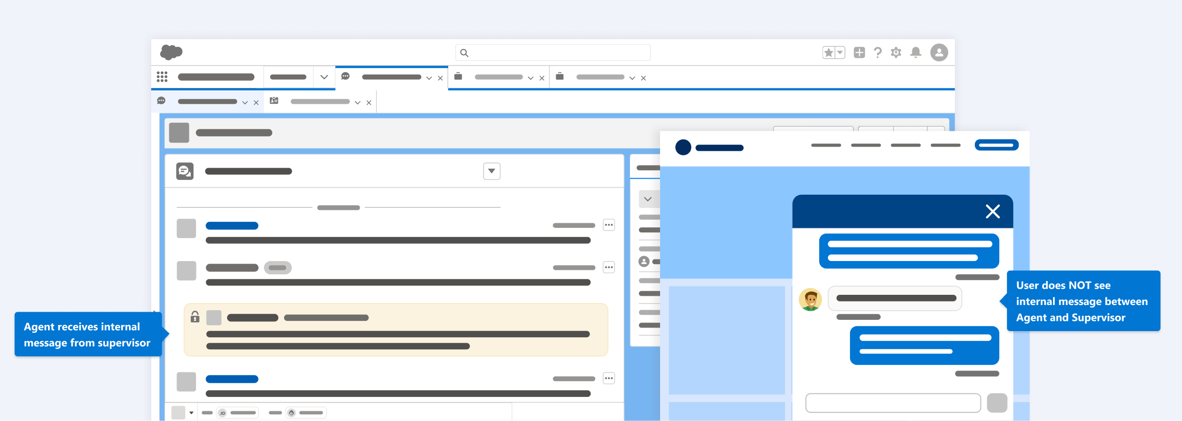
- In situations where a user is being managed by a supervisor, there might be messages sent back and forth in the context of the conversation that only the agent/rep and the supervisor see, but are invisible to the customer. This is a common feature for service use cases and is referred to as supervisor whispers and agent flagging.
Structured Content
Structured content is inherently more complex than sending a text message, that's why previews should be available before a user commits to sending. This preview might show up in the publisher to introduce friction for the sender, minimizing the risk of accidentally sending the wrong thing.
Structured content might include rich interactive messages such as list pickers, carousels, E-commerce checkout, rich links, quick replies, or attachments (like Salesforce data). It's important to keep in mind that there are channel-specific requirements and fallbacks for how to handle all types of structured content.

When a user pastes a link mid-sentence vs. stand alone or at the end of a message, there are some best practices to consider. Links sent in isolation, at the start of a message, or at the end, should be sent as separate messages from other text and rendered as rich links. Links sent in the middle of a statement like www.this.com in the context of this paragraph render only as URLs and do not send separately as rich links.