Notifications Overview
Guidelines
Notifications are messages that deliver information and insights to users, helping drive engagement and productivity.
Introduction
A notification delivers information that is:
- Timely: Delivered at the right time, offering the user an opportunity to act quickly.
- Relevant: Delivered in the best context and through the best channel, optimizing workflow and minimizing disruption.
- Pursuable: Offers a clear path to action.
Each notification should include:
- Origin: The identity of the user(s) and/or entity(s) that initiated the notification.
- Content: Communication that encourages engagement and productivity.
- Action: One or more action that the user can take.
- Timing: Either the time that information is delivered or the time since delivery.
Notifications vs. Interface Feedback
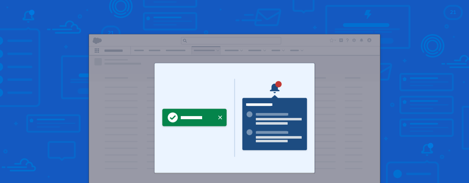
While notifications and interface feedback communicate using similar patterns, they have two key differences.
- Notifications are traceable, meaning a user can view or dismiss a notification, and revisit its content later. Dismissed interface feedback however, is not retrievable.
- Interface feedback is the system's response to direct user input—for example, a confirmation toast confirming a record change. Notifications, on the other hand, are not always reactive and not necessarily system-driven.
Notification Priority
In order to make notifications helpful and not annoying, you should identify what information will be most important for users at each specific point of their workflow. Understanding the urgency level of the notification will help you determine its pronunciation, or level of priority. There are three levels of pronunciation, depending on when the user needs to act: Urgent, Standard, and Discreet.
- User Should Act Now:
An Urgent notification interrupts the user's workflow, presenting information that the user or system prioritizes as most critical. It either enables direct action or offers a clear path to action. - User Should Act Soon:
A Standard notification pushes relevant, timely information that improves productivity. It nudges the user when necessary, but doesn't demand immediate action. - User Can Act Later:
A Discreet notification provides awareness with minimal disruption to workflow. In contrast to push notifications, which demand user attention, these pull notifications allow users to review information at any time.
Priority Levels of Common Notification Components
| Pronunciation | Notification Badge and Tray | Alert | Scoped Notification | Notification Tile | Docked Composer | Prompt | Modal | Welcome Mat | |
|---|---|---|---|---|---|---|---|---|---|
| 1 | Urgent | Yes | Yes | Yes | Yes | Yes | Yes | ||
| 2 | Standard | Yes | Yes | Yes | |||||
| 3 | Discrete | Yes |
Urgent Notifications
An urgent notification interrupts the user's workflow, presenting information that the user or system prioritizes as most critical. It either enables direct action or offers a clear path to action.
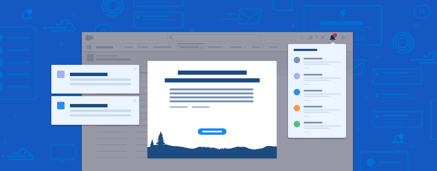
Use these components for urgent notifications: Docked Composers, Modals and Prompts, Welcome Mats, and Notification Tiles.
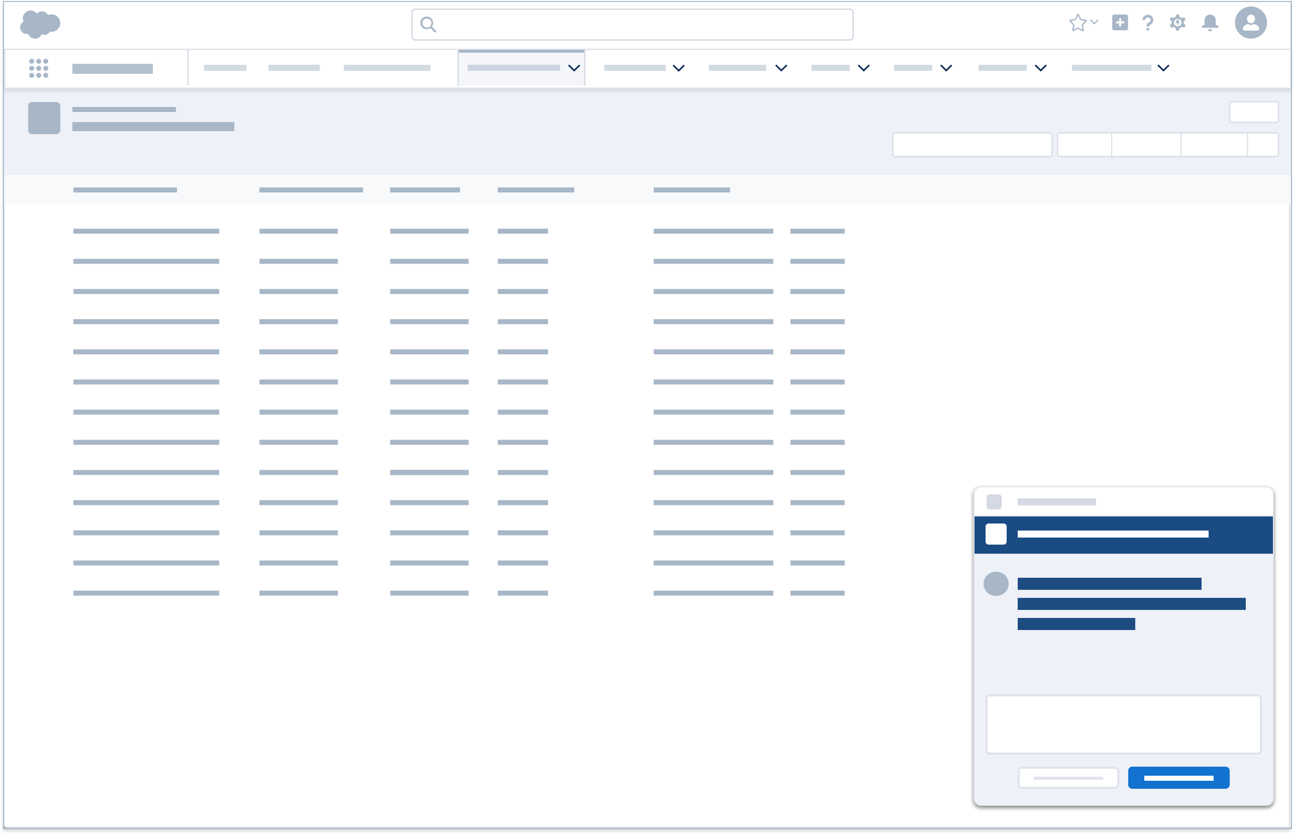
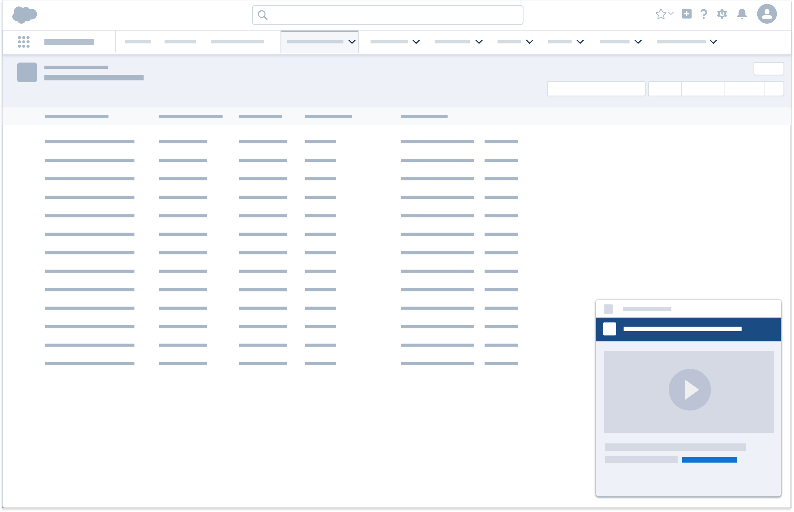
Docked Composer
In live discussions and collaborations, the docked composer appears at the bottom right corner of the screen, expanded to display the full content of a notification. Once a docked composer is minimized or dragged to a new window, it is marked as read.
Accessibility Note: Ensure that there is a secondary, keyboard-friendly mode for dragging the minimized composer. Give it a clear header and some sort of landmark role. Since its role on the page may of variable importance we want to make it a "region" labelled by the aforementioned header. When a new message occurs an aria-live polite message should fire and reference the name of the region so that a user can easily discover this region.
Docked composers are also used in onboarding, to highlight features that can boost productivity. Once dismissed, they may be viewed at a later time.
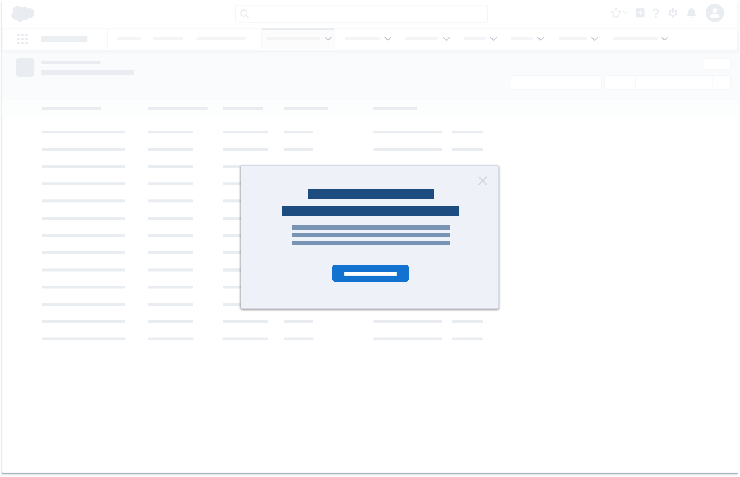
Modals and Prompts
Modals and prompts present servicing information that requires halting the workflow.
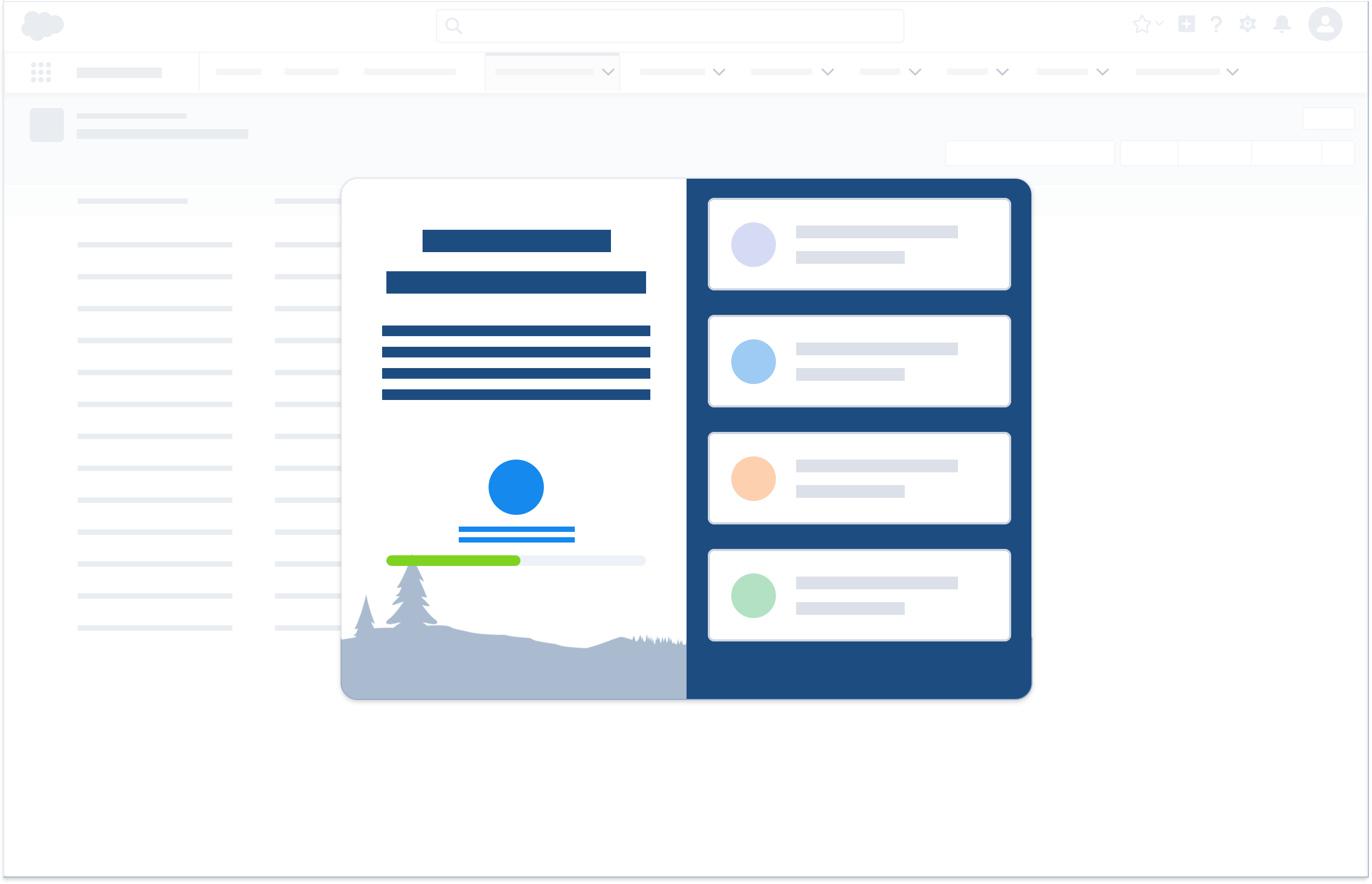
Welcome Mat
Welcome mats are specialized modals with a unique look and feel. They offer deeper learning designed to boost a user's productivity, such as information on new features.
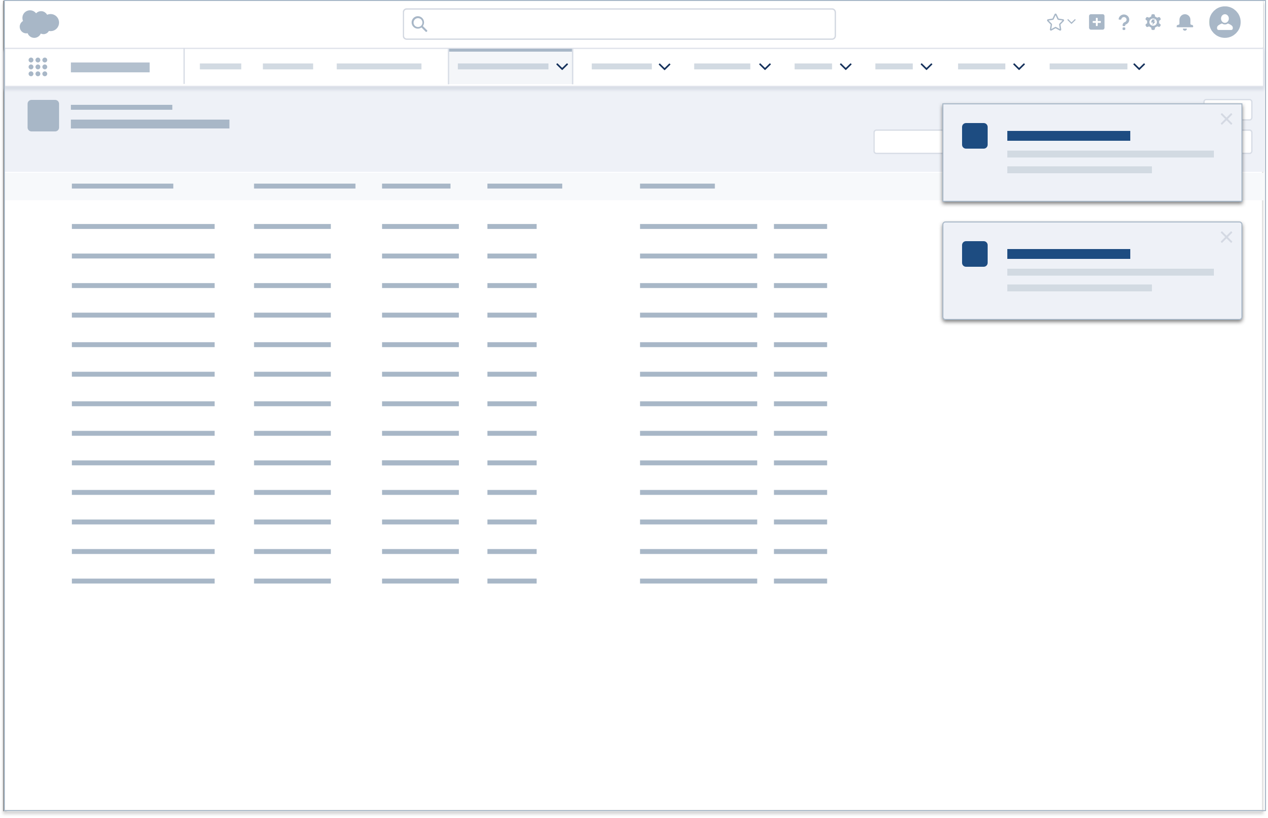
Notification Tiles
Notification tiles present time-sensitive information such as work reminders, upcoming calendar events, and due tasks. Once dismissed, they may be viewed in the notifications tray.
Accessibility Note: When notification tiles timeout, we must follow the principles outlined in WCAG Guideline 2.2. If there are one or more visible at a time they should be contained in a named region and be delivered as an HTML list wrapped in an element with aria-role="log". When they open or launch their headline should be read as an aria-live polite.

Standard Notifications
A standard notification pushes relevant, timely information that improves productivity. It nudges the user when necessary, but doesn't demand immediate action. It should offer either a way for the user to learn more or a clear path to action.
Use these components for standard notifications: Alerts and Scoped Notifications.
Alerts
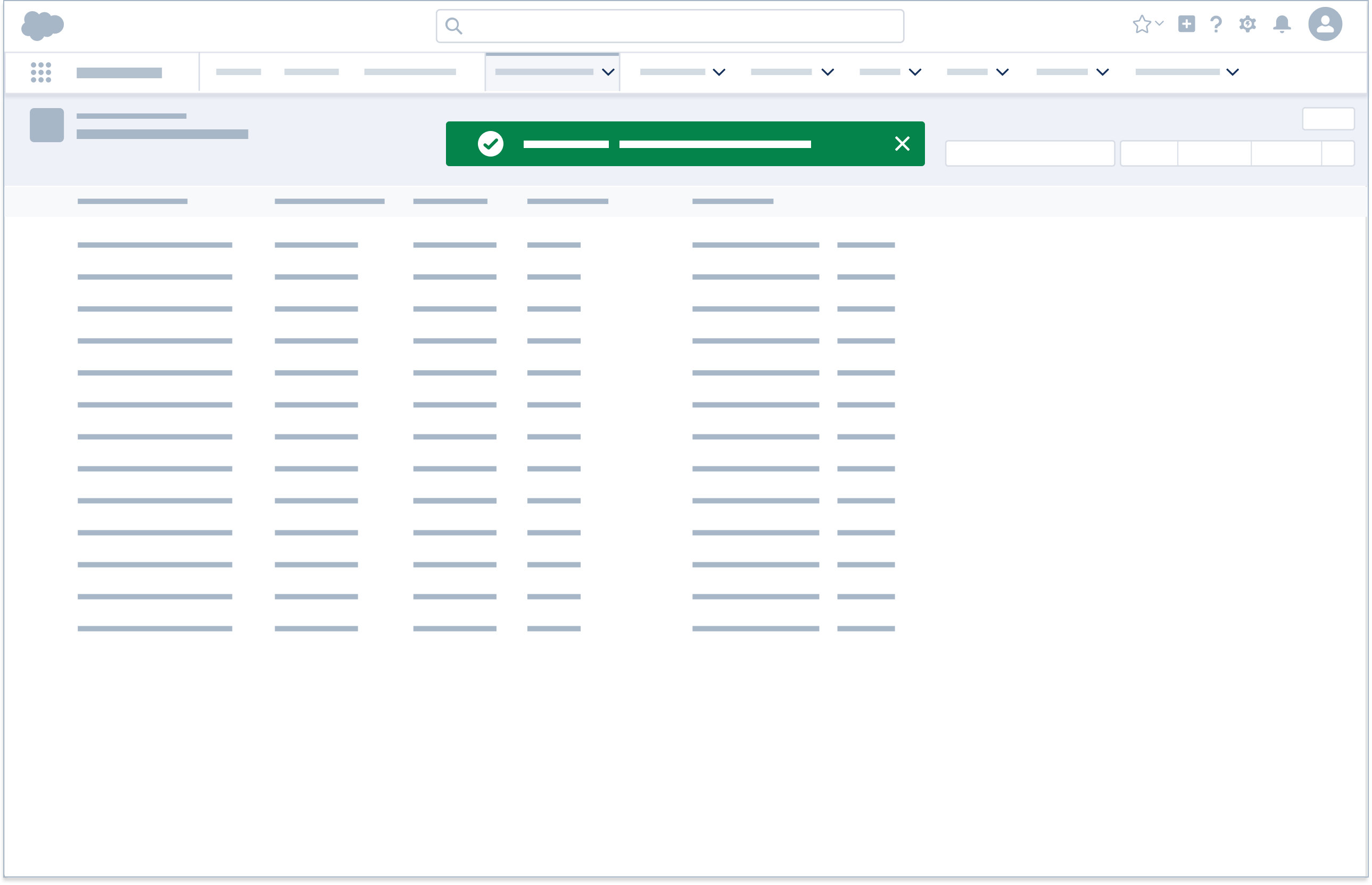
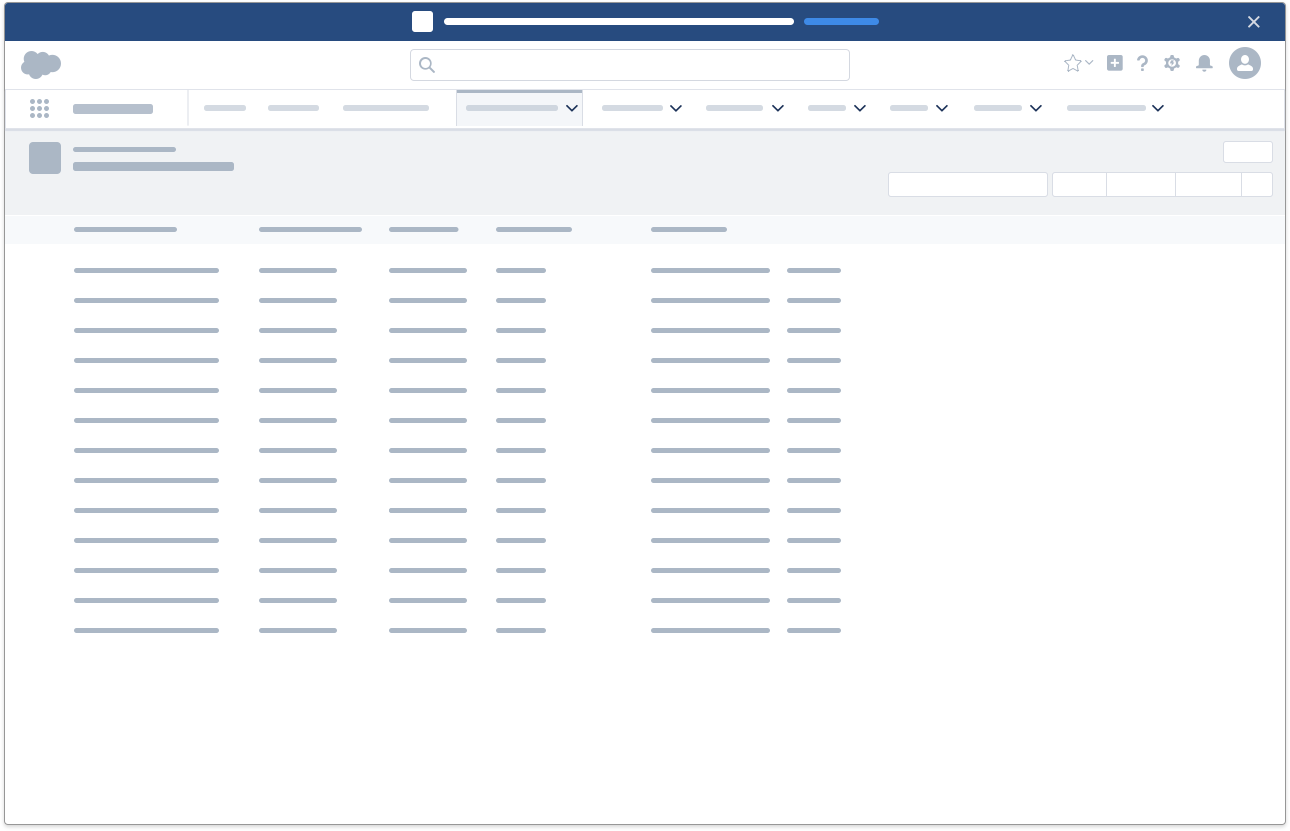
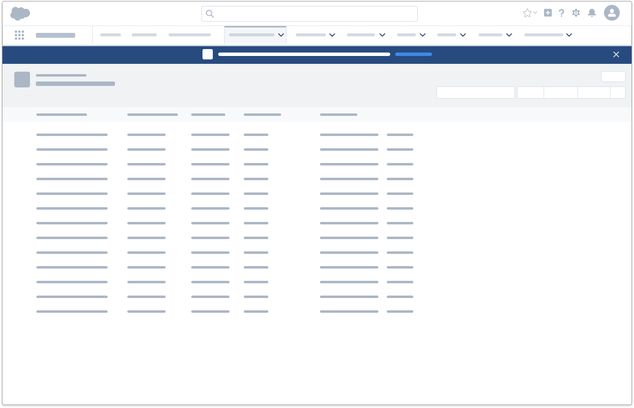
An alert presents status information for either the entire app or a specific tab or record. It persists unless dismissed by the user or replaced by a more current alert.
App-wide alerts include system maintenance alerts, browser alerts, and online/offline status alerts. In contrast, a record status alerts the user (and any collaborators) to changes to a specific record.
An alert can show one of the following states:

Error: Tell the user that they cannot proceed with their Salesforce experience.
Accessibility Note: This alert type should use aria-role="alert" and aria-live="assertive".

Informational: Show an admin-related status.
Accessibility Note: This alert type should use aria-role="status" and aria-live="polite".

Offline: Inform the user that they are in offline mode.
Accessibility Note: This alert type should use aria-role="status" and aria-live="polite".

Warning: Warn the user of potential issues with their Salesforce experience.
Accessibility Note: This alert type should use aria-role="status" and aria-live="polite".
Scoped Notifications
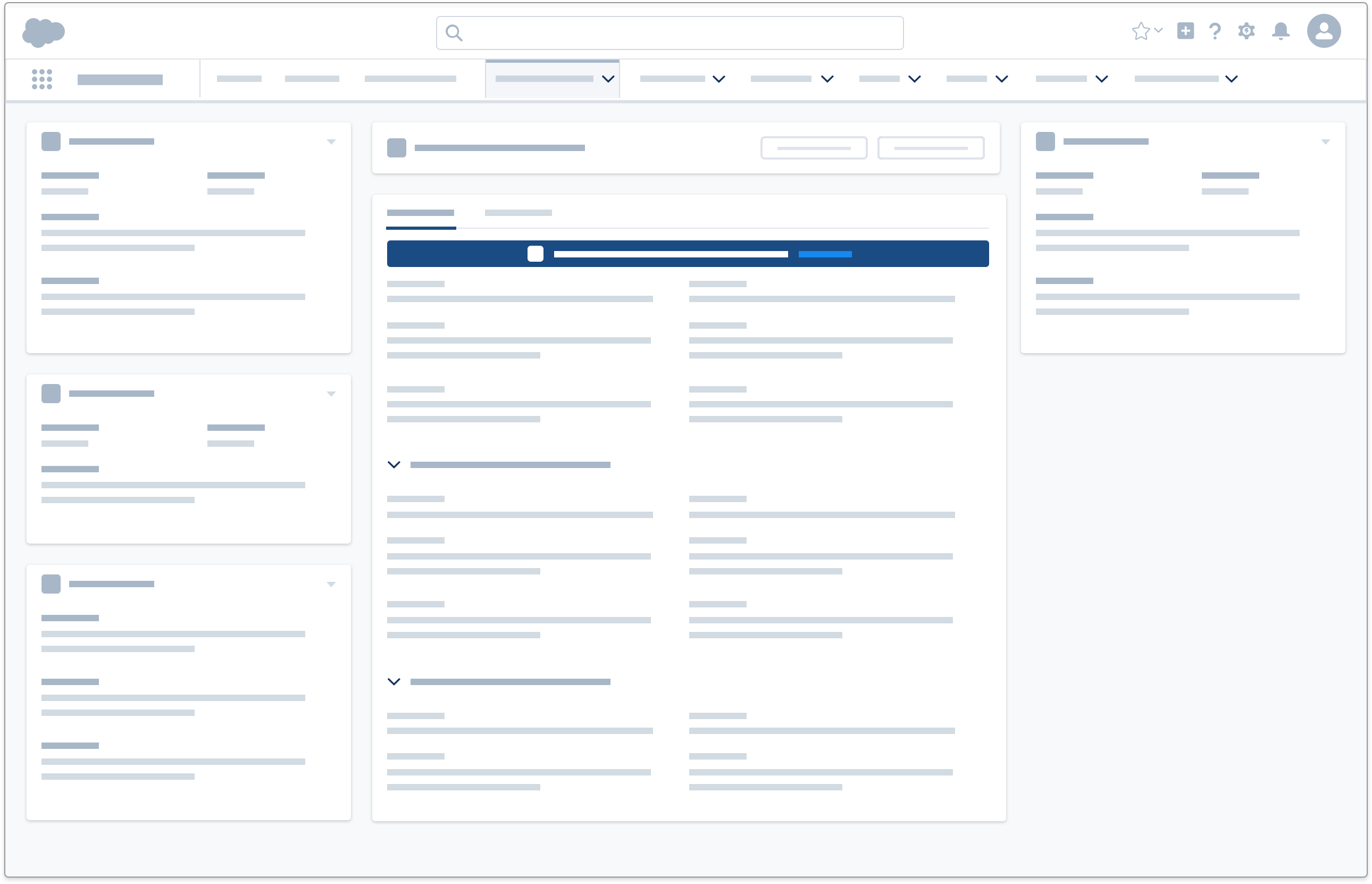
A scoped notification presents information specific to a component or page section. It is tethered to its specific component and cannot be dismissed or viewed elsewhere.
Discreet Notifications
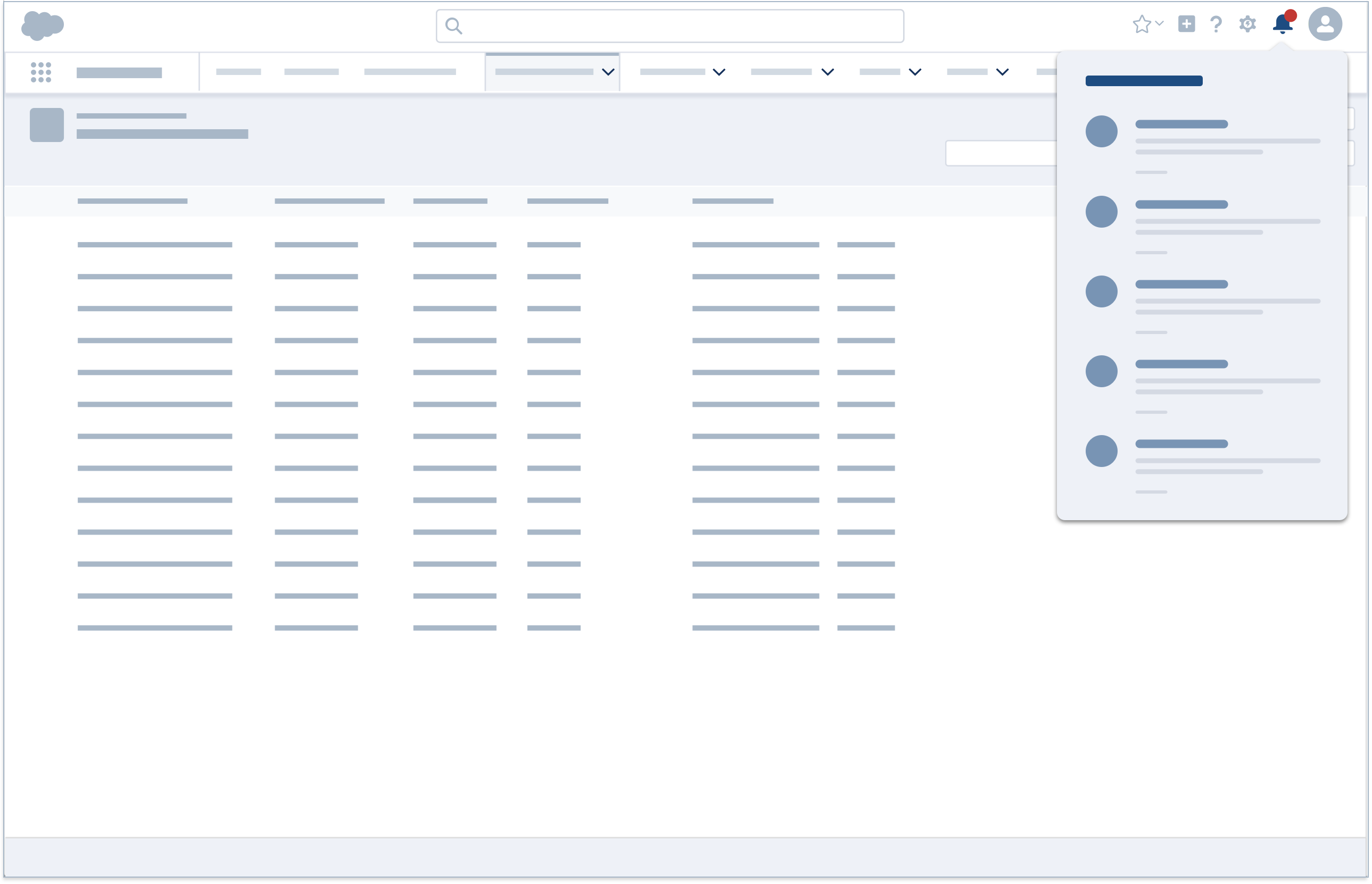
Discreet notifications behave as a pull notification, so they don't alert users or disrupt their workflow. However, they are still recorded by the system and can be reviewed at any time in the notifications tray.
Use these components for discreet notifications: Enumerated Badge and Notification Tray.
Enumerated Badge
This bell badge shows the number of new notifications available for review in the notifications tray. Clicking the bell icon opens the tray and resets the counter to zero. It does not, however, mark notifications as read.
Accessibility Note: Badge notifications are meant to be non-interruptive, but the visual treatment will likely draw the eye to the notification count icon. Consider an aria-live polite announcement on page load to simulate this for low or non visual users.
Notification Tray
The notifications tray displays all urgent, standard, and discreet notifications for a specified time. Here users can review previous urgent and standard notifications, and discover discreet notifications that didn’t trigger alerts.

Notification Distribution
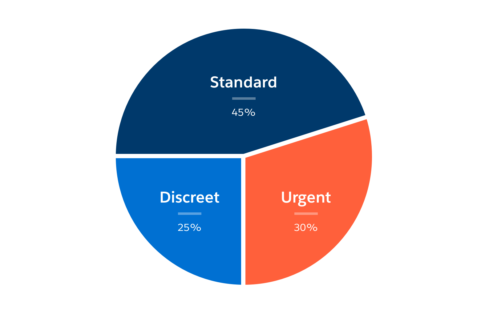
Notifications are an inevitable part of the user experience, but it's important not to over or under communicate. Treating all information as urgent would overwhelm users and potentially lead them to ignore notifications as a whole, while delivering all information discreetly would result in crucial information being overlooked and negatively affecting productivity.
To maintain higher levels of engagement and productivity, aim for this approximate balance of notification types: 30% urgent, 45% standard, and 25% discreet notifications.
