Metric Display
Best practices for presenting numbers that change with time.
Introduction
Metrics are the special numbers we use for monitoring change. They help us better understand how a system is changing (or not changing) over time.
We do this by:
- Defining a set of measurements, or metrics that report useful things about the status of a system of interest
- Capturing the value of these metrics at regular intervals and storing them as a time series, indexed by metric name and timestamp
- Comparing the current value for each metric to past values to show how the system is changing, or trending, over time.
Monitoring is directly tied to taking actions. If you are monitoring a system where change is expected or desired, and change isn't happening, then you need to define the actions required to create change. Conversely, if you are monitoring a system where you want stability, but are seeing change, you'll need to define and take actions to stabilize the system.
Therefore, to create the best metric experience for our users we need:
- to show them the latest value
- show how the value has been trending
- and enable them to initiate useful actions directly from the display itself
Consistent Displays and Alerts
The goal of this guideline is to help the Salesforce design community to deliver consistent and useful metric visualizations to our end users. This matters because metric displays are powerful tools for building consensus among collaborators, for understanding cyclical patterns, and as a place for initiating actions when something isn't right. And these powerful experiences will be the most intuitive and easy to use for our customers when they look and work the same across the entire Salesforce ecosystem.
However, without discounting the value of a consistent metric display experience, it is critical for designers to realize that, in practical use, almost no one wants a metric display as their primary monitoring experience. Instead, users prefer some kind of alert, coming on a high visibility channel such as a text or chat, that grabs their attention when something important changes and directs them to a display where they can begin to understand what has happened and how to respond.
The point is that when your product requirements include the display of metrics, your UX strategy must also consider the companion issue of alerting. A great monitoring experience brings metrics and alerts together in a way that enables the end user to understand them as both entirely complimentary and completely distinct.
Elements of Metric Visualization
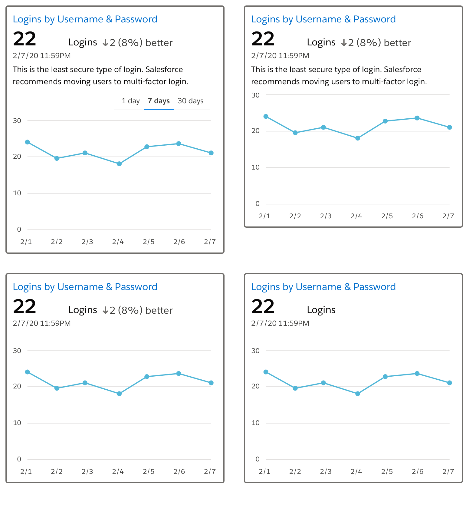
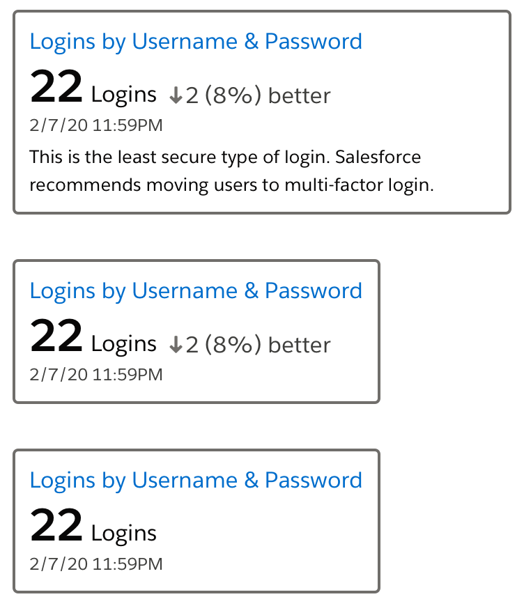
Metric Tile
The most common format for displaying metrics is a tile—a specialized kind of data visualization designed for communicating the value of a metric relative to time. A metric tile must show the most current value of the metric and is infinitely more useful if it also visualizes a comparison of current and historical values.
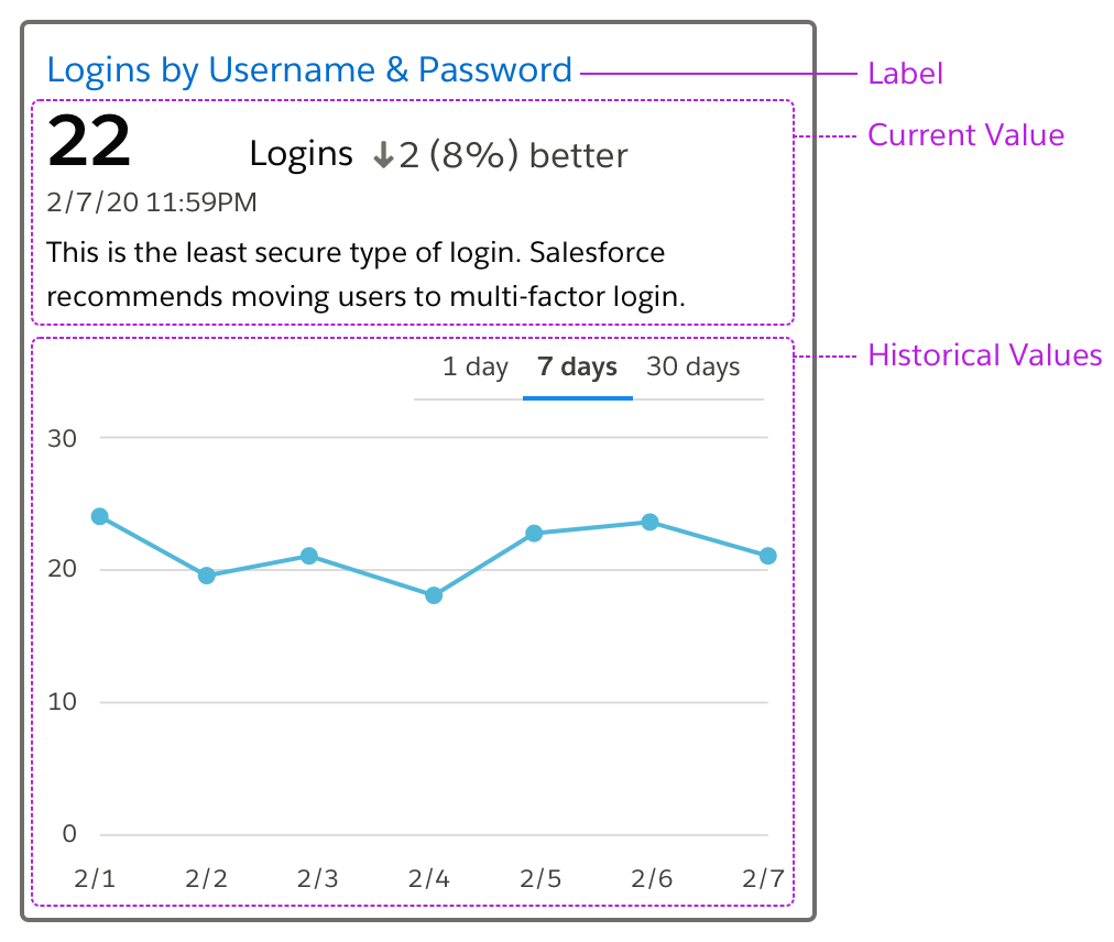
Object Model
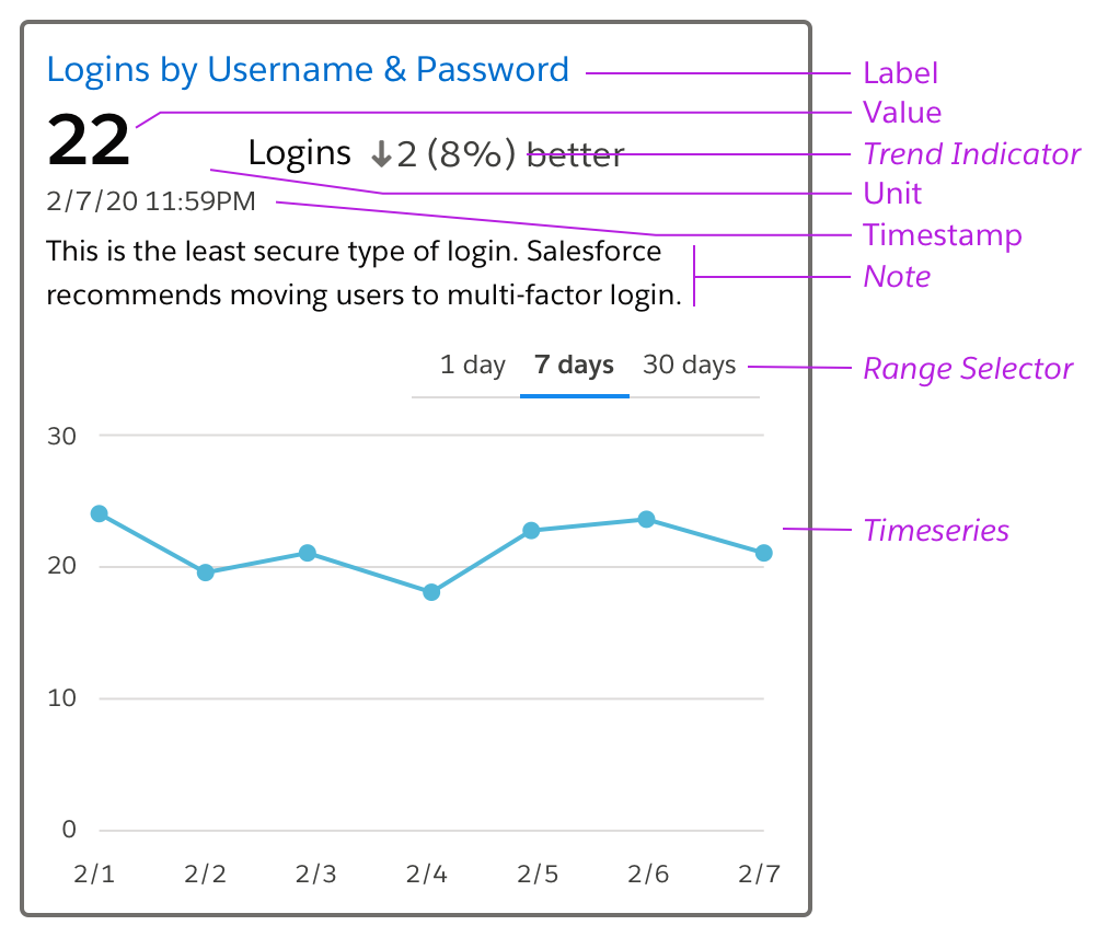
Label
The metric label must be an end user recognizable version of the metric name. This is important because metrics tend to be stored in back end systems with cryptic names that need to be converted to a form that is meaningful to an end user before appearing in the metric tile. The label text should also function as the Detail View.
Value
The value is a number representing the most recent reading for the metric available. It is critical that the metric value is displayed immediately adjacent to the label, following a natural reading order, and without any elements other than white space separating them.
Unit
The unit is a name defined by standards, regulatory agencies, or common sense that identifies the magnitude of the thing the metric is measuring. The unit must be displayed because knowing the unit is critically important to assessing the meaning of the metric. For example, a hot tub water temperature reading of 100 has entirely different implications if the unit is Fahrenheit or Celsius! For common quantities with well known units, it is fine to use an abbreviation.
Timestamp
The timestamp establishes the recency and relevance of the value. It should report the time when the metric was actually measured, not when the metric was received by the application displaying the metric.
Trend Indicator (Optional)
The trend indicator uses text and a directional icon with an accessible label to communicate which way the metric is trending. The amount of change can be given as an absolute value, a percentage, or both. The pointer direction is, by convention, up when the metric increases in value, down when it decreases, and pointed to the right when there is no change.
The trend indicator has two important aspects to consider:
Compared to What?
To report a trend you need to compare a current value against a previous value. For example, stock trend indicators compare the current value against the value at yesterday's market close. Unfortunately, most metrics don't have a well understood previous value so you will need to choose a reasonable option such as 1 day ago or 1 week ago, or the penultimate value, and accept that your viewer may need to consult documentation to know which you've chosen.
Which Direction is Better?
A second complexity arises if you want the trend indicator to communicate whether the change is good or bad. In this case your application will need to know, for each metric being displayed, whether the end-user considers an increase good or a decrease good. Ensure that color is not the sole indication of better/worse by using a secondary indication such as an icon or text that says "better/worse".
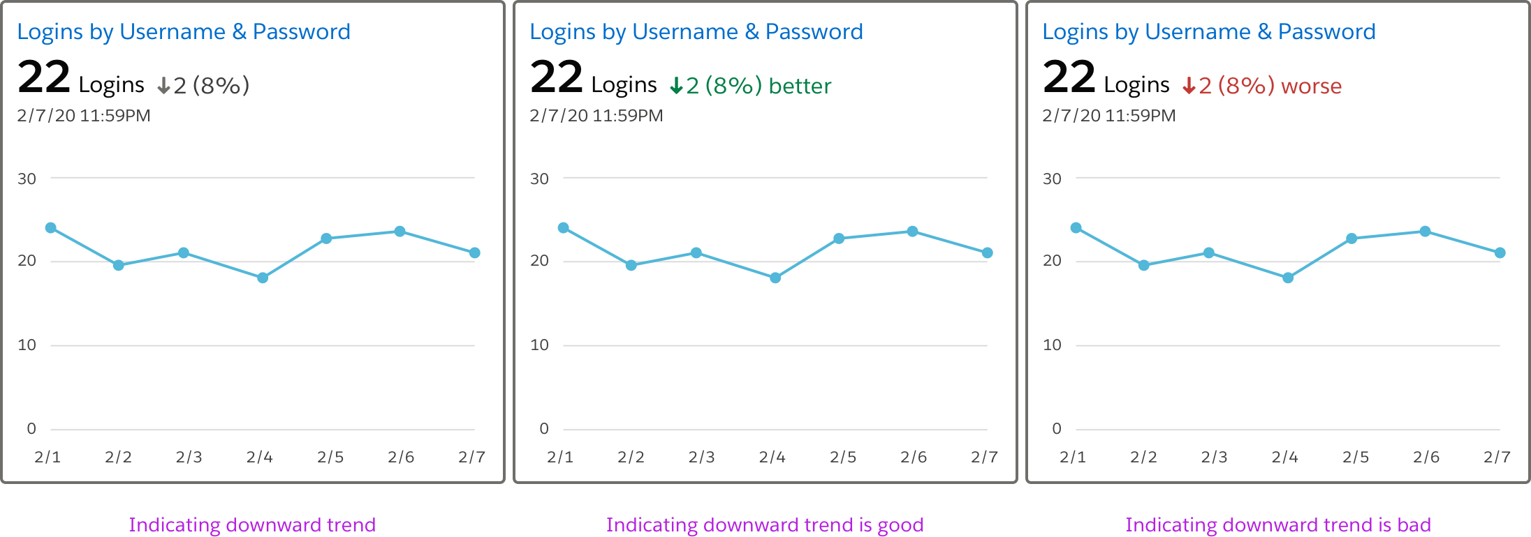
If a tile includes a time series (discussed below) then the trend indicator is somewhat redundant and so, given the complexities and clutter it creates, may be best removed from your display.
Note (Optional)
The note is a text string that provides additional context for understanding what the metric means, why it is important, or anything else about it that a user might find helpful. Including a note is useful if your end user views the metric display infrequently. If your target persona is an expert then suppress the note and save screen real estate. If a note is present it should be associated to the element that defines the card (which has role group) with aria-describedby.
Time Series (Optional)
The time series is a line chart showing the behavior of the metric over time. Each point in the timeline should be reachable with the keyboard and when it has focus it should be labeled with the axis data in a way that's available to assistive technology. The points can all be one tab stop, using the arrow keys to move between them. The value of the most recent data point displayed in the time series should match the latest value reported in the region above. The appearance of the line chart should follow existing SLDS guidelines.
A time series is extremely useful because it intuitively conveys the metric value's range, rate of change, and behavioral patterns in the same display. Unfortunately, a lack of the back end services required to store the historical data and render it to the screen may make it impossible to include a time series chart in your application.
Range Selector (Optional)
The range selector allows the user to set the time period displayed along the x-axis of the time series. For performance reasons, allow only specific time ranges for which the data can be cached. Obviously, if a time series is not being included in the display, a range selector would not be included either. If the range selector is used, the chart's accessible label should include information about the current range.
Tile Variations
The optional and required features of the metric display may be combined in a variety of sensible ways depending upon use case and technical constraints as shown in these examples.
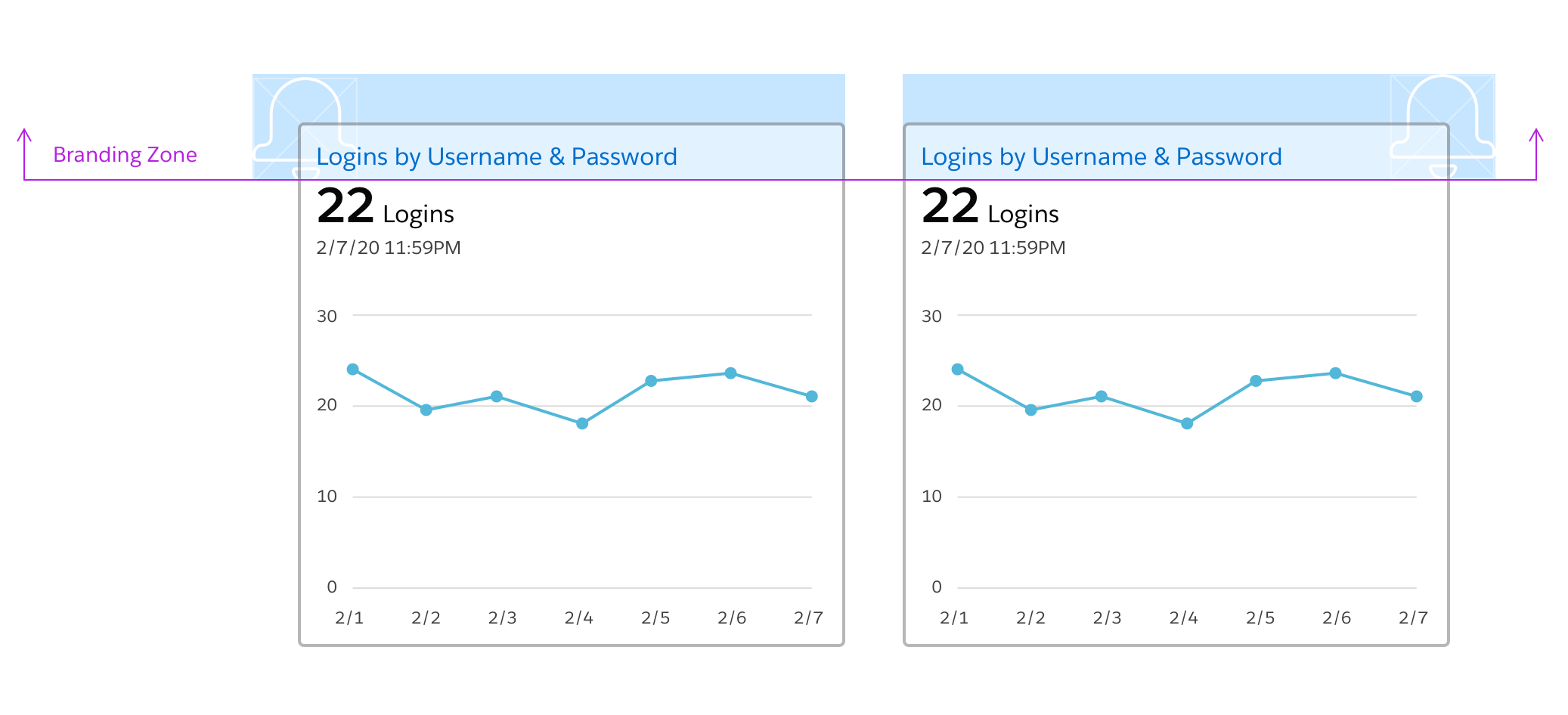
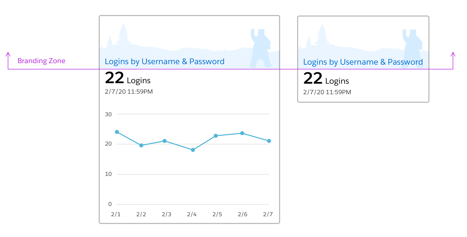
Branding
In general, avoid decorating the metric tile with marketing pixels. However, in cases where product requirements insist on branding, limit it to the label region where it will not interfere or distract from the data visualization.
Overlays
In the general display case, each tile represents a single metric. However, to enable correlation and comparison it is extremely helpful to use overlays.
There are two kinds of overlays:
Metric on Metric
The metric on metric overlay case can be best understood by imagining two or more transparent tiles are sitting on top of each other, aligned on the time axis of the trend line display.
A tile in the metric on metric overlay tile includes:
- a title that explains the grouping or purpose of the overlay.
- a legend that enables differentiation of the lines in the trend display.
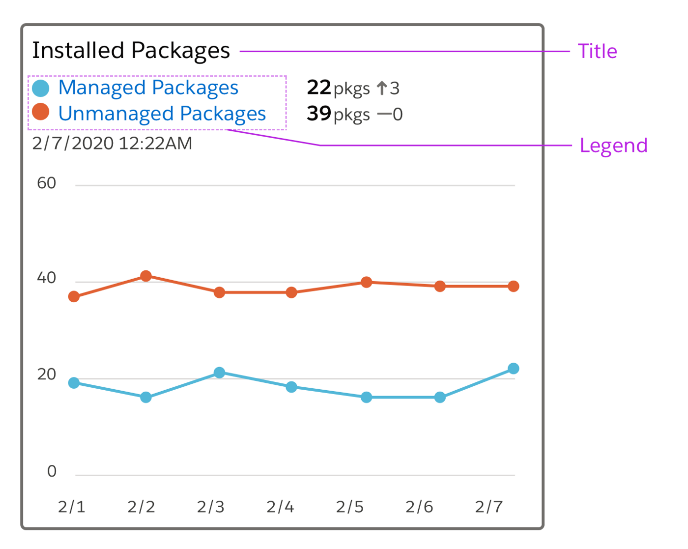
The scale for the y-axis can be tricky with this kind of overlay. If the values of the metrics being overlaid share the same order of magnitude the scale range can represent the range of the actual values. However if the value of the metrics differ by 1 or more orders of magnitude the scales must be normalized. Because the range of future values cannot usually be known, normalizing the scales always is the safest approach. Legend and trend line colors need to contrast 3:1 with each other AND the background. For this reason it is often recommended to use a pattern in addition to color to differentiate data.
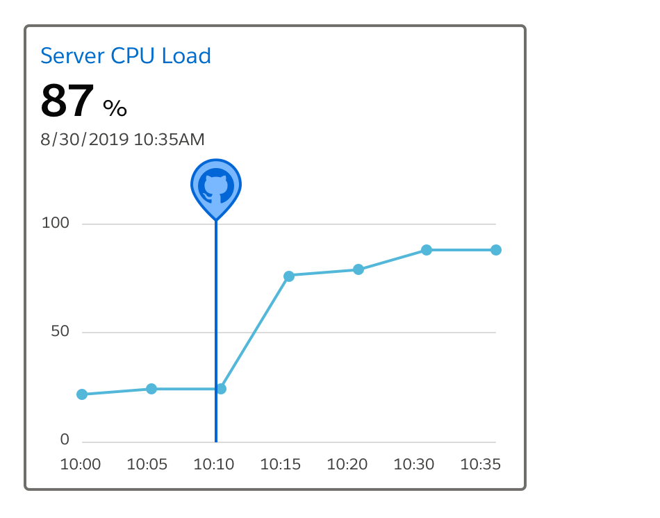
Event on Metric
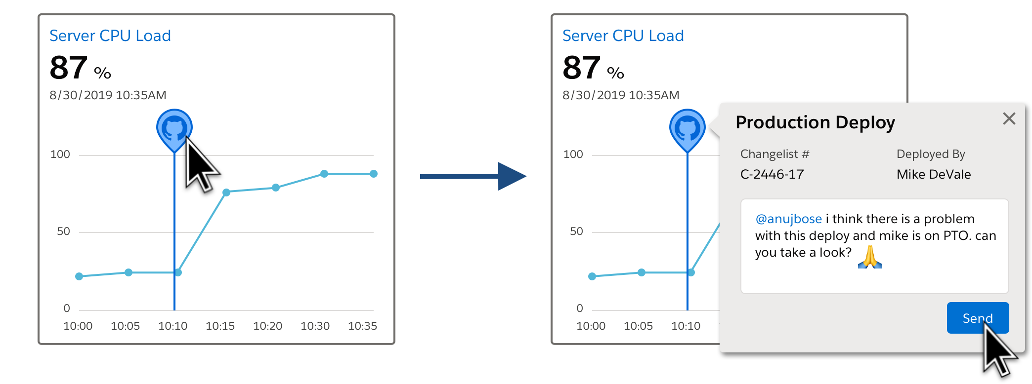
The Event on Metric overlay displays markers for events on the same timeline as the metric. Events are things that happened that have a timestamp, but no scale. This kind of overlay is a powerful way to demonstrate or explore whether there is a temporal correlation between the event and the behavior of the metric.
For example, overlay below shows a code check-in event overlaid on a time series of CPU Load, a common hardware performance metric. In this made up example, it looks like perhaps the check-in introduced a bug that is causing CPU load to rise dramatically.
Patterns
Now that we've fully described the metric tile let's discuss the most common ways that this basic unit is used in interfaces.
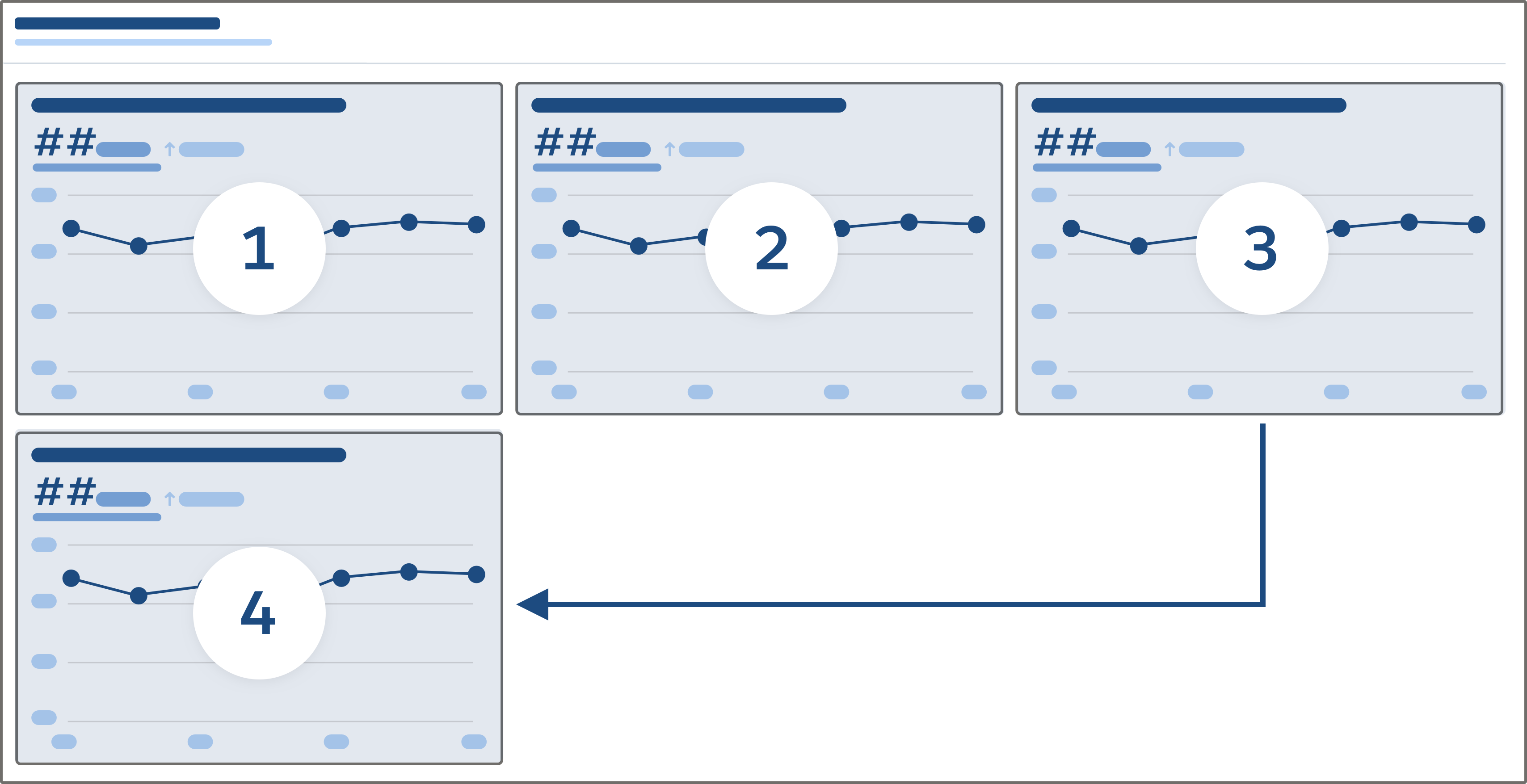
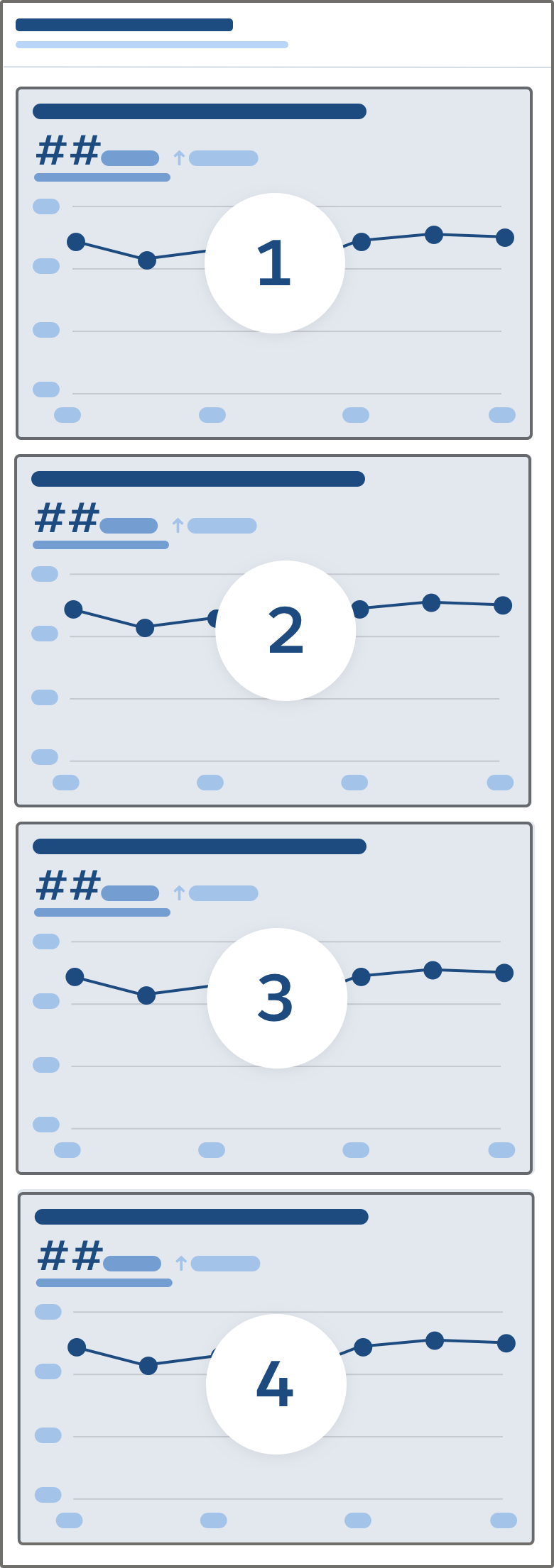
Dashboard
A metric dashboard contains an overall title, and within a clear visual boundary or border, a tabular display of tiles with uniformly sized rows and columns.
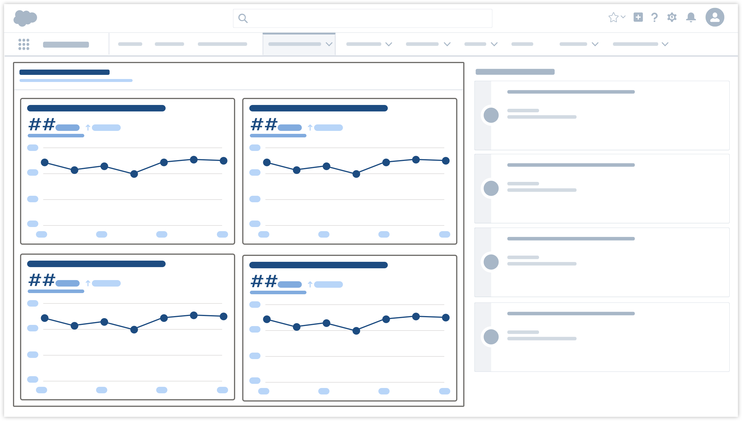
A dashboard presentation works well for two different use cases:
- to display an index of all available metrics which the user can search, browse, and filter to select metrics of interest.
- to display a predefined set of critical metrics that a group of users have agreed to use to manage a specific business process.
Each of the tiles in the dashboard must be synchronized by time and share the same background variables. Background variables define context; quantities that are not displayed in the tiles themselves, but influence the reported values. As a somewhat silly example, if you had a dashboard that displayed metrics to do with e-commerce, the viewer will assume—and you should ensure—that all tiles display values are coming from the backend of the same e-commerce website!
The dashboard layout should be responsive. Use max-width & min-width rules on the tile to drive the number of columns displayed at each breakpoint.
KPI Banner
A KPI (Key Performance Indicator) Banner is a special case of the dashboard that appears as a single row (or column) of tiles displaying only latest value information, no time series. The KPI banner may or may not include the title and grouping border shown in this illustration.
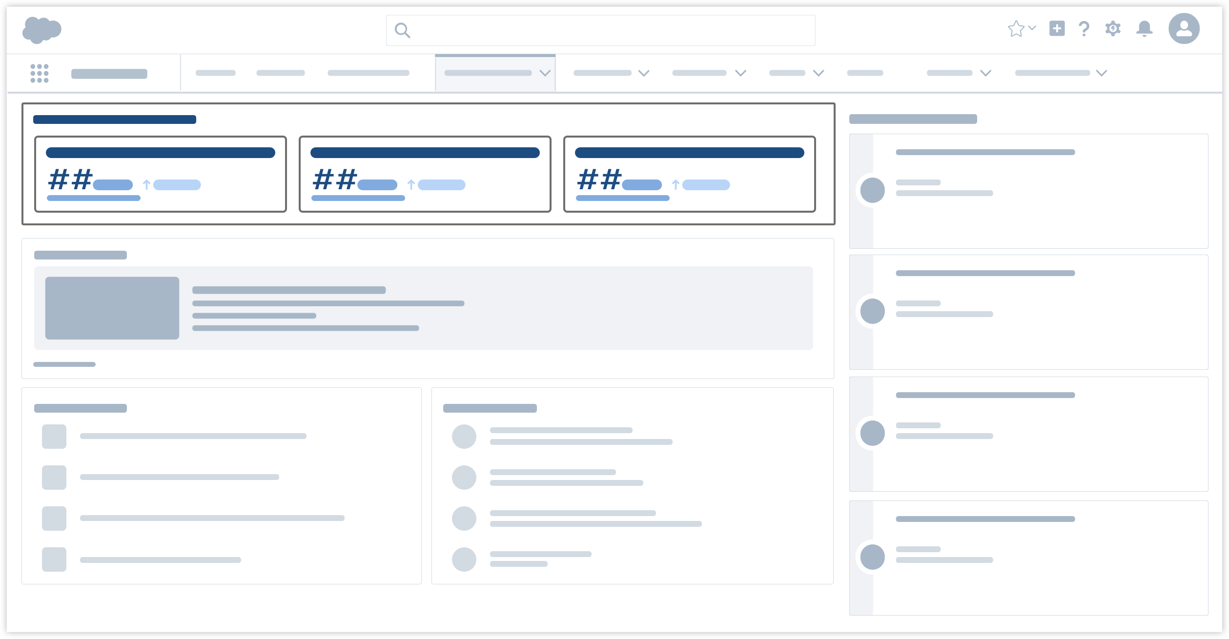
The common use case for the KPI Banner is to display, compactly, the latest value for a set of metrics critical to evaluating the success or failure of some business process.
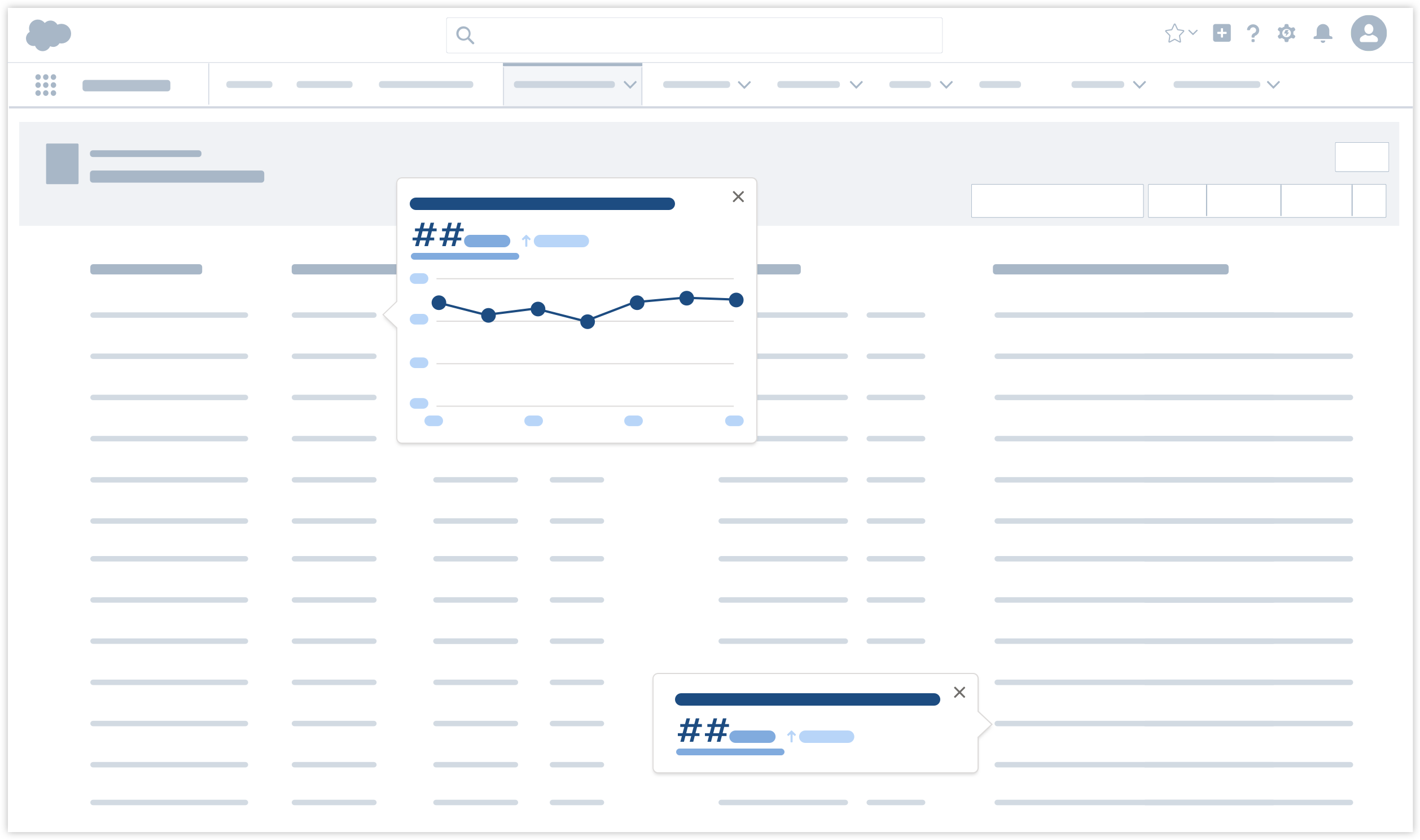
Compact Layout
The compact layout supports an opt-in-to-detail experience that supplements or enriches a more general display. In this case some form of the metric tile is displayed within a standard popover component. A popover-based approach will need a lot of accessibility attention. If we want an approach like this, there will need to be a control that opens the chart on click and sets focus into the chart so the user can navigate it. The chart popover cannot open on hover or focus alone.
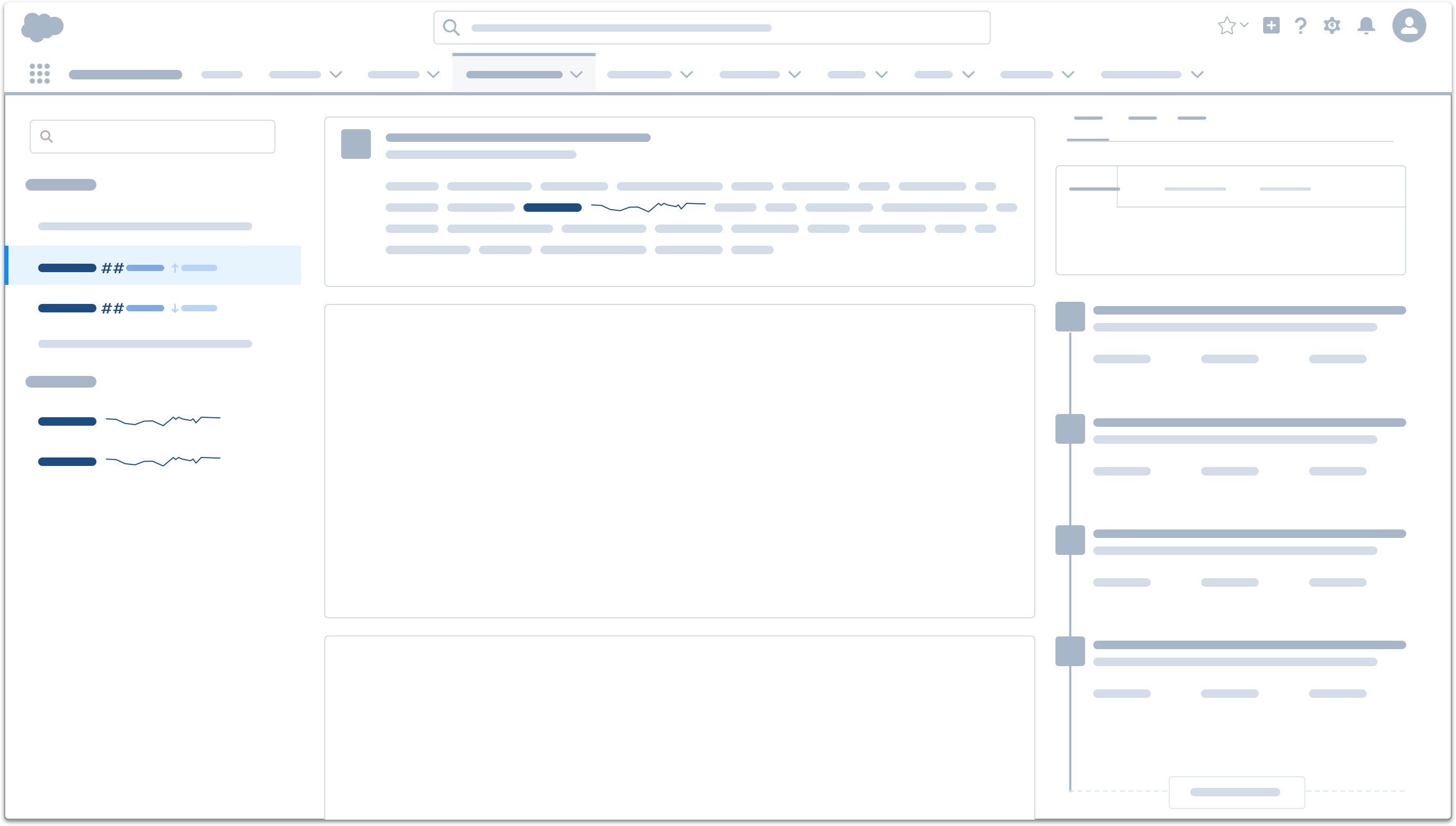
Inline
Inline provides an extremely compact metric presentation directly in the context of free text or lists. The inline case will either display a simplified version of the current value region of the metric tile, or a simplified version of the time series region (commonly called a sparkline) but not both at the same time. An inline chart will need an accessible alternative like a text-based summary or a table-based alternative presentation of the data (which can be visually hidden).
Interactivity
Users needing to respond to the change they see in your metric display will very much appreciate being able to do so quickly and intuitively directly from the display itself.
Messaging
Perhaps the most basic action a person takes in response to noticing an anomaly is to share the discovery with someone else to get confirmation that there is a problem, or to ask them to fix the problem.
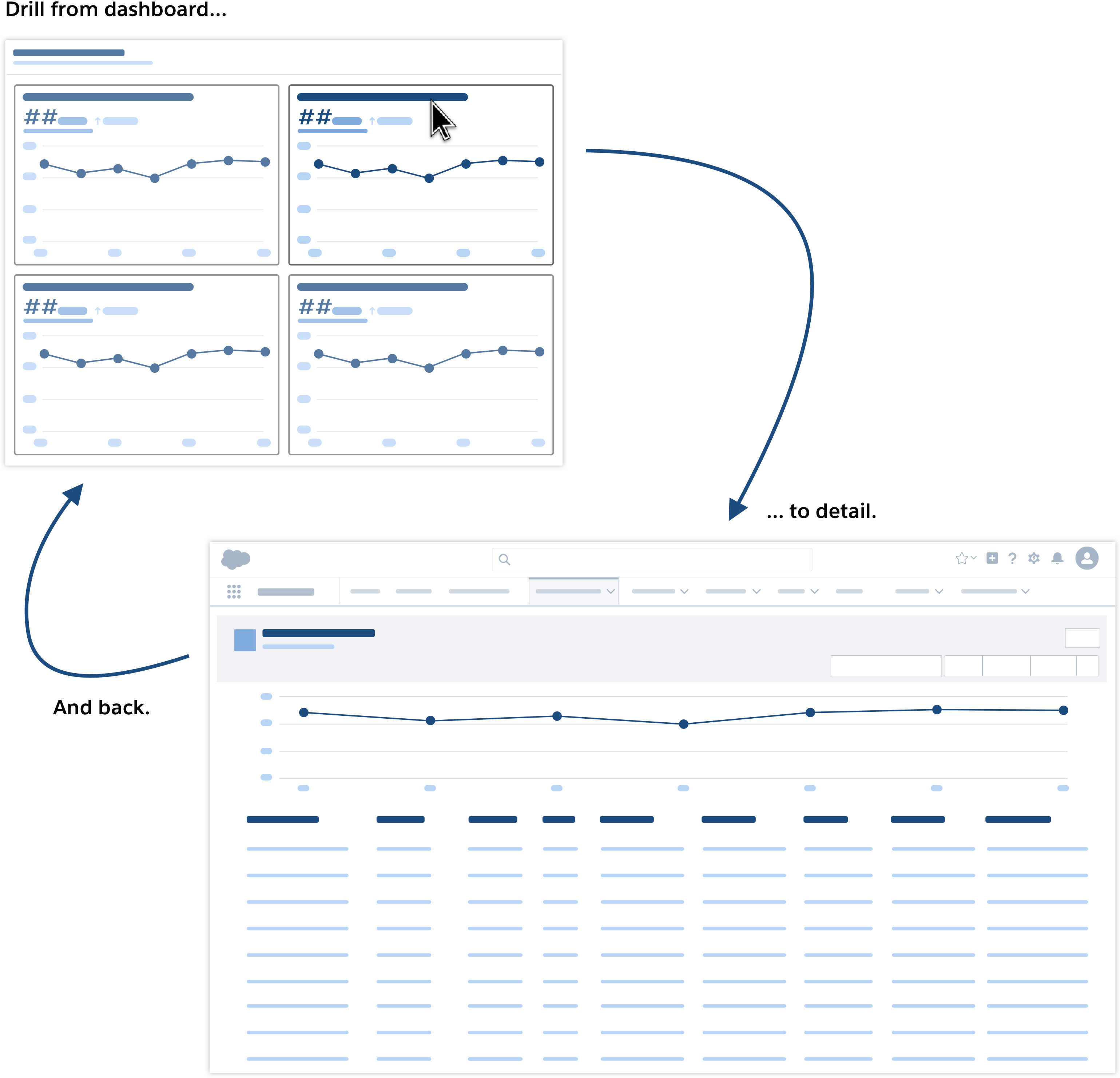
Drill Down
Regularly checking a metric you care about gives you an intuitive sense of what normal and anomalous behavior patterns look like and what you can do to influence them. However, before responding to a change, it is nice to be able to review the underlying details to be certain of what is going on. Users expect to be able to navigate from the metric to a separate detail display.
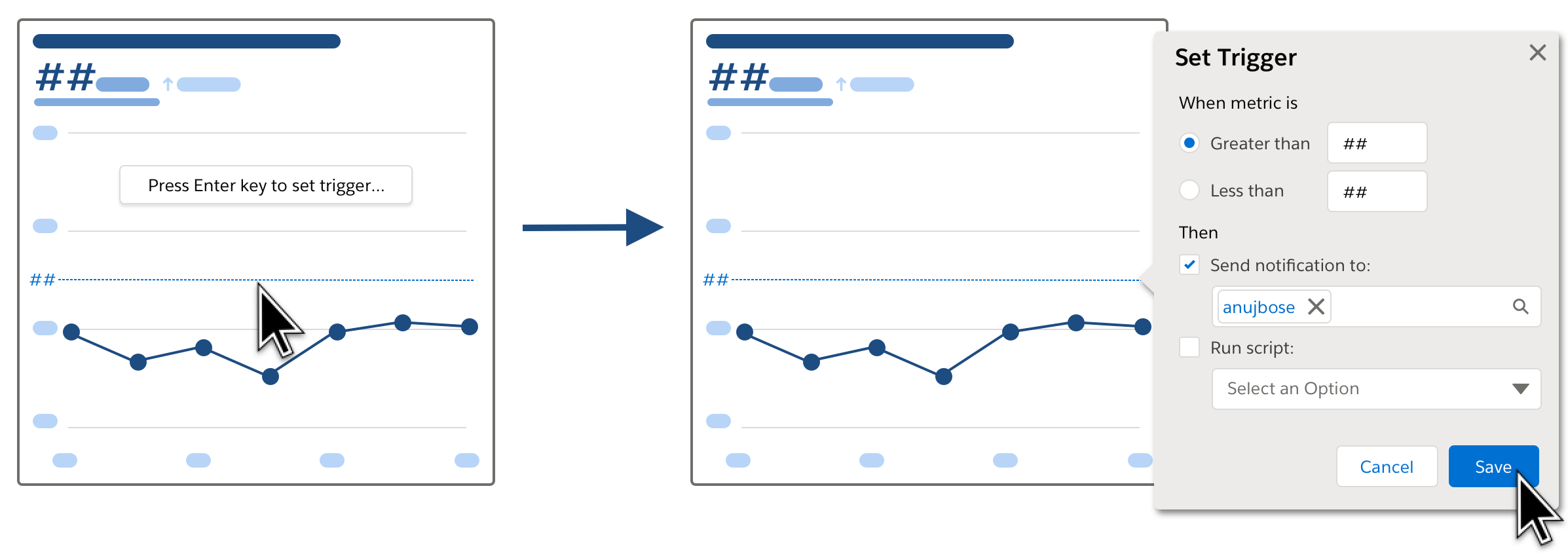
Triggers
Metrics are signals communicating the state of a system or business process. When a metric is understood well enough to be partitioned into ranges of "good" values versus "bad" values, then it can be used to create triggers that initiate automation—including alerts—whenever a metric rises above or falls below a threshold value.
The most intuitive interactive model will enable the trigger to be set directly on the display.
Alerts
Simple, clear, standardized metric displays are powerful tools for building consensus among collaborators, understanding cyclical patterns and initiating actions when something isn't right. However, despite their utility, almost no one wants their monitoring experience to start with a metric display!
Instead, people want their monitoring entry point to be real-time alerts coming on high visibility channels like text or chat that grab their attention. People want these alerts to be important. And finally, if the alert requires a response, people want to be able to jump directly from the alert to the kind of richer display we have been discussing here.
Think of alerts and metrics as two sides of the same coin: when your product requirements include the display of metrics your UX strategy must also include a plan for alerting.